IE8 Rapid Fire Site Test
I can't spend much longer playing with IE8 or my wife will skin me. However, from my cursory browsing experience I'm worried. Either the devs have a good deal of work to do or I'm going to be very busy with CSS rules for a while.
Here's the University of Bradford site in IE8:
And to try to compare apples with oranges, here it is in Firefox 3 beta 3:
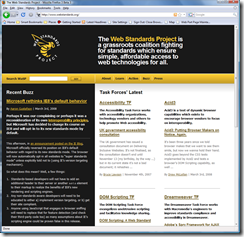
More surprisingly, here is the Web Standards Project site in IE8:
and again, in Firefox 3b3:
Apple.com, IE8:
and Apple.com, Firefox 3b3:
As you can see, there are issues with the placement of some elements on each of these pages. I have not yet started to investigate why, but I am honestly surprised. Given the much-touted, 'vastly-improved' web standards support I was not expecting the number of issues I have seen. Ironically, as usual, old style table layouts look great...
I'll try to do more comprehensive testing tomorrow. Stay tuned.


