Developer Quick Guide (101) to Using Windows 8
In many of my presentations on Windows 8 over the last year, there has been a raft of standard questions on how to use Windows 8 effectively, so here is the first of a set of using Windows 8 posts. This aim for this post is to clarify terms and show the main Windows 8 features to allow future posts a frame of reference.
First of all Windows 8 is simple to use, but there are a few gotchas for developers as there is a need to use both desktop and “Modern UI (MI)”. Needless to say that having multiple screens makes the work easier, but knowing how to drive Windows 8 using keyboard and mouse will make development/test/release much faster.
My main observation is that it takes a little while to get to used to both the old and the new at the same time, but quite quickly you will find it works very very well, in fact in my opinion better than previous versions of Windows.
In this post I will concentrate on the touch interface and in follow up posts I will cover driving Windows by Mouse and Keyboard,the concepts are the same but for clarity I have separated them out. Touch,Keyboard and mouse are all first class citizens in the Windows 8 world. In a later post I will cover general tips for organising tiles and finding windows features you thought you might have lost.
The User Experience
The User Experience currently called the Modern UI is quick and fluid, previously it was commonly referred to as Metro however that was a misnomer as the name referred to the design principles on which the Windows 8 user experience was based not the User Experience itself.
The key thing to remember as a developer is that the User is in Control, if the user does not like your app it is gone, no more forcing your application to the front, sticky dialogs of “are you sure you want to close my application” and ignoring the users response. The age of the User is here and developers beware only well behaved applications need apply.
Lock Screen
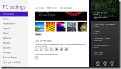
The lock screen is of more interest than people will give it credit for, it contains user selected mini information nuggets such as appointments, mentions in tweets etc., these bite site pieces of information are relatively easy to offer from your own application and offer the user a single glance update of information when they first visit their device.
Start Screen
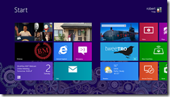
The Start Screen is where Windows 8 Starts! Very much like Windows Phone 7 the idea is to show the key applications that you use day in day out, while allowing the applications to keep you the user informed by displaying real time data that the applications deem to be important to you using Tiles which have the appearance of being live by constantly updating (with pre-canned information).
The tiles shown on the Start Screen can be updated both by the application running e.g. the picture viewer allows pictures to be the Tile image.
Selecting a tile is done by touching it with a drag down motion (Drag to select) this displays a context based application bar allowing you to change the size of the tile, uninstall, unpin and turn live tile updates off/on
All Apps
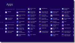
While the start screen shows live tiles of the applications that the user has chosen, swiping up from the bottom displays the Application Bar on the right hand side is the All Apps Icon, selecting the All Apps, displays all of the applications installed in groups.
Selecting an application allows it to be re-pinned to the main screen.
Navigation
The basic premise of navigation is swipe left/right for pages and select (tapping) the item you want . When an application is running the charms bar(see later) will continue to display, but noticeably the application bar becomes application centric with context aware menus being displayed.
At any time there is only one “Master” application running normally full screen, when an application is run all others are suspended
To swap applications a swift swipe from the left side (just off the screen onto the screen) will swap out the current application to the next in the application stack.
Snap
The snap view is a compensation to allow two applications to run at once on screen, by definition all applications need to cope with the snap view and most do well. The view is achieved by dragging an application from the right but not more
Notifications
Notifications in MI are system wide (desktop and MI) in real terms this is a great tool as MI applications can still provide updates on the desktop. The notifications come in two forms Toasts and System messages, however only Windows can deliver System messages.
Charms
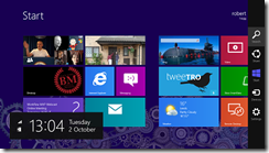
The Charms bar is accessed by swiping from the right hand edge of the screen
The Charms bar has been built to allow users to do a lot of common actions in a standard way by either using devices such as printers, external screens, connecting to other applications or perform actions such as search and view settings. In essence a developer should view the Charms bar as contracts that the application can use and offer out to the users device.
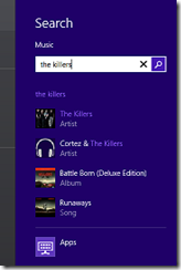
Search
The search charm is very straight forward, it allows you to search an application for content.
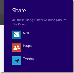
Share
The share charm allows a user to share content with another application such as mail and many well known brand social media applications.
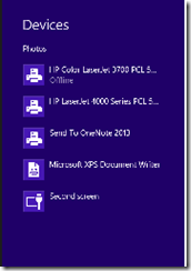
Devices
The devices charm allows applications to send data to printers, phones and even streaming video to DLNA devices.
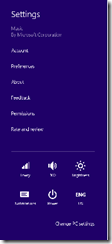
Settings
The settings charm is a split personality offering as it offers the settings for the application and basic systems settings at the same time. Of all the Windows 8 features initially I was most unsure but it does work.
Summary
Hopefully this post has clarified terms on the Windows 8 User Experience. In a future post I will also cover the basic Windows 8 design metaphors.
b.
